BRAND STYLE GUIDE: TYPOGRAPHY

Typography

Our main typeface is Inter, which is free to use and download.

Different weights and font characteristics are defined for each use case with readability principles in mind.

Download Typeface

Headlines

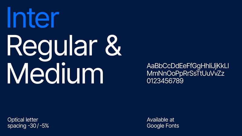
Typography sample of Inter font in Regular and Medium weights showing uppercase, lowercase letters, and numbers, with optical letter spacing noted, on a dark blue background.

Body text

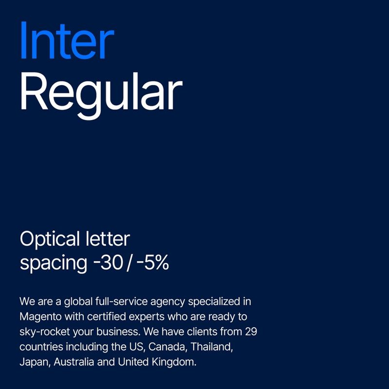
Text showing font style Inter Regular with optical letter spacing -30 / -5% and a message about a global full-service Magento agency with clients from 29 countries.

Technical elements

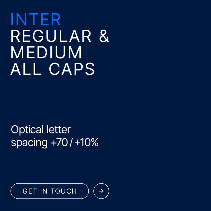
Text sample showing 'INTER' in blue and 'REGULAR & MEDIUM ALL CAPS' in white on a dark blue background, with smaller text reading 'Optical letter spacing +70 / +10%', and a button labeled 'GET IN TOUCH' with an arrow.

Readability Principles

In order to improve readability and usability for our brand assets and design materials, line lengths for body text usually should be between 40 to 60 characters.

Letter-spacing

Letter-spacing, also called tracking, refers to the uniform adjustment of the space between letters in a piece of text.
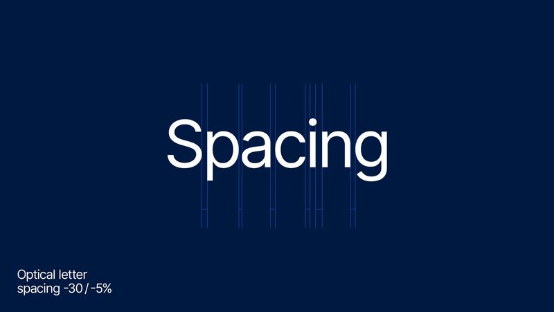
White text 'Spacing' on dark blue background with blue vertical spacing guides and caption 'Optical letter spacing -30 / -5%'.

Line Length

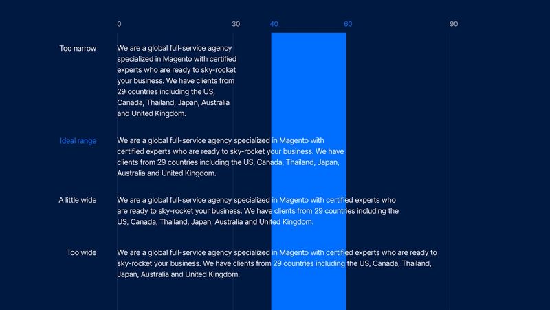
In order to improve readability and usability for our brand assets and design materials, line lengths for body text usually should be between 40 to 60 characters.
Body Text

Bar chart showing ideal range for text width at 60 characters with examples of too narrow, ideal, a little wide, and too wide text.

The ideal line length is 40-60 characters per line for English body text

Line Height

In order to improve readability and usability for our brand assets and design materials, line lengths for body text usually should be between 40 to 60 characters.
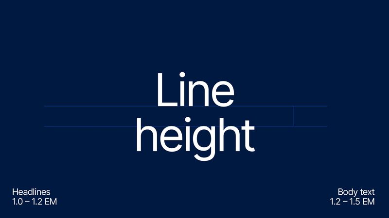
Illustration explaining line height in typography with example text 'Line height' and recommended EM values for headlines (1.0-1.2 EM) and body text (1.2-1.5 EM) on dark background.

Typography Summary

01

Use Inter Regular & Medium only

02

Adjust kerning / letter spacing for every material

03

Pay attention to small details and readibility principles