Brand Style Guide: Logo

Logo

Our logo is the primary visual symbol of our brand — a simple and elegant wordmark with magic symbol representing our brand name.

The lettering is custom made and carries distinct typographic elements to have it's own distinct characteristics.

Our logo is modular and can be splited into three different parts – full wordmark, letter mark and symbol.


Logotype

Wordmark
Magebit wordmark
Registered Trademark
Magebit logo in white on Space Blue

Symbols

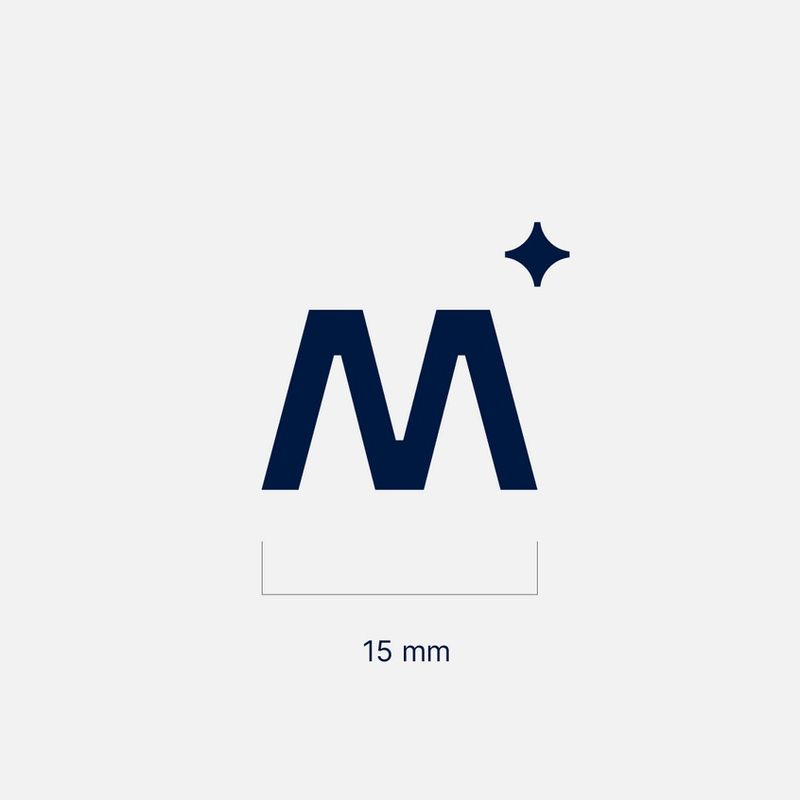
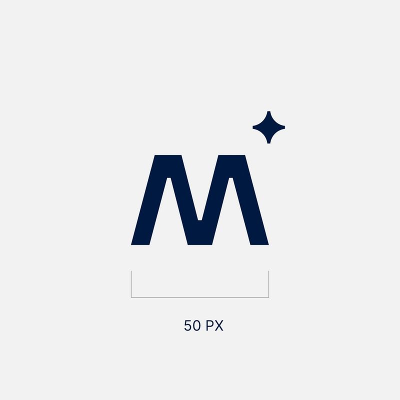
Magebit letter mark
Magebit magic star

Wordmark Construction

Our wordmark is carefully crafted to make sure it fits well within the whole brand system and stands out in the crowd. Sharp lines combined with round shapes are optically adjusted to achieve optimal visual balance.

Clearspace

Clearspace around the logo is equal to the M-height of the wordmark. It gives breathing space and helps the logo to stand out.
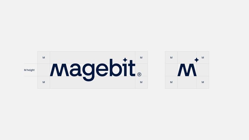
Magebit logo and letter mark with clearspace marked by the letter M

Clearspace Exceptions

Application icons, profile icons and various objects allow for exception of clearspace rule.
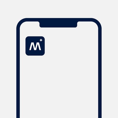
App icon with Magebit letter mark on a phone screen
Application icons
Magebit wordmark in a circular profile icon
Profile icons
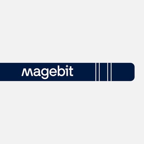
Magebit wordmark on a navy material bar
In use on various materials

Colour & Scale

On neutral or blue shade colors the logo is set in one of our primary base colours (white or dark blue) to maintain consistency across all brand materials. On materials with red, green and purple shades use the same shade dark colored logotype.

Main colors

Magebit logo colour example

Additional color use

White on Tech Blue
White on Tech Blue
White on Neon Red
White on Neon Red
White on Emerald
White on Emerald
White on Violet
White on Violet
White on Space Blue
White on Space Blue
White on Dark Sienna
White on Forest
White on Forest
White on Deep Purple
Space Blue on Sky
Space Blue on Sky
Dark Sienna on Sunset
Forest on Mint
Forest on Mint
Deep Purple on Lilac
Black on White
Black on White
Black on Gray 01
Black on Gray 01
Black on Gray 02
Black on Gray 02
Black on Gray 03
Black on Gray 03
White
White
White on Gray 05
White on Gray 05
White on Gray 06
White on Gray 06
White on Black
White on Black

Stars
White on Tech Blue
White on Tech Blue
White on Neon Red
White on Neon Red
White on Emerald
White on Emerald
White on Violet
White on Violet
White on Space Blue
White on Space Blue
White on Dark Sienna
White on Forest
White on Forest
White on Deep Purple
Space Blue on Sky
Space Blue on Sky
Dark Sienna on Sunset
Forest on Mint
Forest on Mint
Deep Purple on Lilac
Black on White
Black on White
Black on Gray 01
Black on Gray 01
Black on Gray 02
Black on Gray 02
Black on Gray 03
Black on Gray 03
White
White
White on Gray 05
White on Gray 05
White on Gray 06
White on Gray 06
White on Black
White on Black

Scale

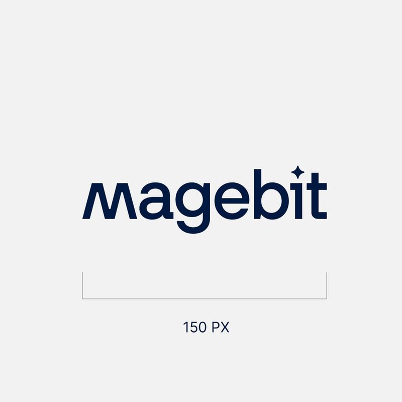
Our logo is designed to scale well in large and small sizes on print and screen. Smallest size for wordmark width: 20 mm or 150 px.
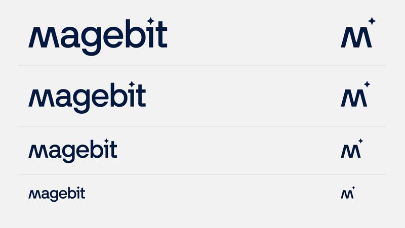
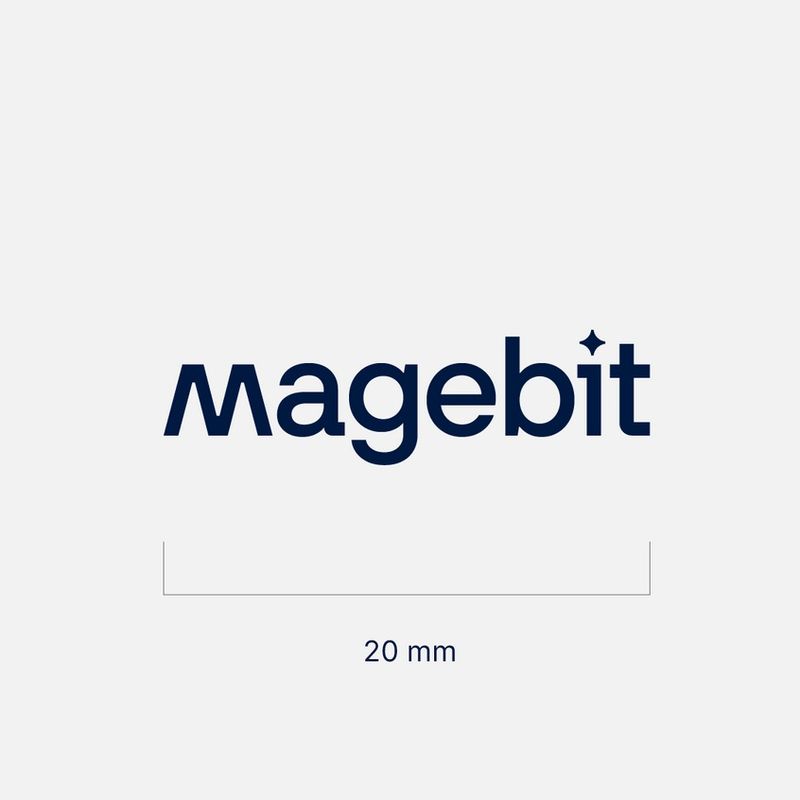
Magebit wordmark shown at decreasing scales
Minimum size example for a Magebit logo version

Logotype placement

The logo placement is flexible but should always be prioritzed to have most brand impact.

Priority Nr. 1

To have most impact, prioritize using centered logotype and not putting any other assets in the same block. When logotype is centered in the block, in most cases it allows us to use it at larger size and improve brand visibility.

Priority Nr. 2

In cases where space and composition is tighter and you can't center the logotype, attach it to one of the block corners.

In cases where block isn't wide enough or another element is using the same block as well, you can center the logotype at the bottom.

In all placement cases (except for the center one), use the same margins as other content elements.
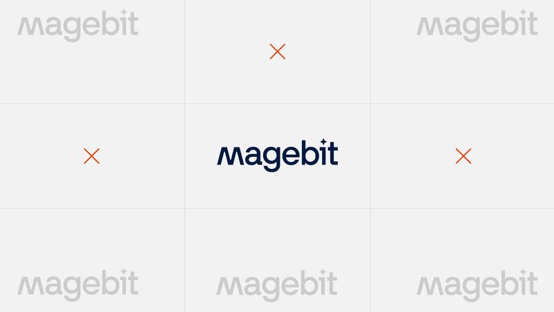
Centered Magebit logo placement with surrounding exclusion marks

Logotype centering

Ignore ® and Magic star when centering logotype horizontally, while vertically center logotype by letter M height.

Horizontal and vertical centering guides for the Magebit wordmark

Profile Icons

Social media profile icons are individually designed based on specifications. They are an exception to the clearspace guidelines and are sized optically to best fit each shape.

Wordmark Icons

Use the wordmark profile icon for public social networks, such as Facebook, Instagram, LinkedIn, etc.
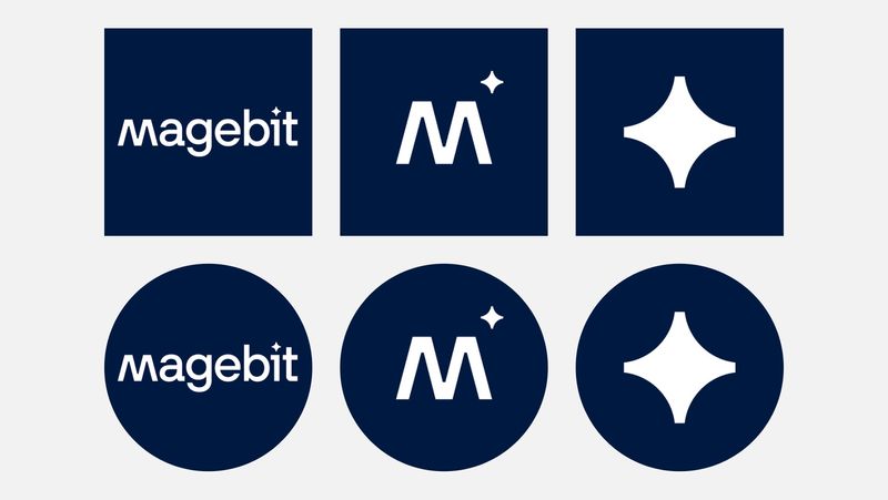

Wordmark and letter mark profile icon examples

Logo Guidance

  • Don’t mix or change colours of logotype elements
    Don’t mix or change colours of logotype elements
  • Don't box the logotype, use it cleanly
    Don't box the logotype, use it cleanly
  • Don't adjust kerning for logotype
    Don't adjust kerning for logotype
  • Don't adjust any shapes & elements of the logo
    Don't adjust any shapes & elements of the logo
  • Don't alter the angle of the logo
    Don't alter the angle of the logo
  • Don't use logo on backgrounds with low contrast
    Don't use logo on backgrounds with low contrast
  • Don't add any letters or symbols to logotype
    Don't add any letters or symbols to logotype
  • Don’t add any additional elements to logotype
    Don’t add any additional elements to logotype

Logo Summary

  1. 01

    Modular and adaptable

  2. 02

    In most use cases - White or Space Blue

  3. 03

    Prioritize logotype centering in the block when possible

  4. 04

    Use consistent sizing on same type of materials